Y
our engineering team puts a diagram on the screen. Boxes, arrows, labels you half-recognise. Someone explains why they've structured it this way. You nod. You don't fully follow, but the meeting moves on.This happens in nearly every funded startup with a non-technical founder at the table. It's not a knowledge problem it's a vocabulary problem. System architecture diagrams follow patterns. Once you know the patterns, you can read most diagrams well enough to ask useful questions, spot gaps, and understand what your team is proposing to build or change.
Here's what the diagram is actually showing you, and how to engage with it.
What a System Architecture Diagram Is Trying to Show
An architecture diagram is a map of your software. Not the code itself the structure of the system at a higher level. It shows what components exist, how they're connected, and how data flows between them.
Most diagrams aren't trying to be comprehensive. They're trying to communicate one specific thing: here's the current state of the system, or here's how we propose to change it, or here's what broke and why. The context matters. Before reading the diagram, know which of those three it is.
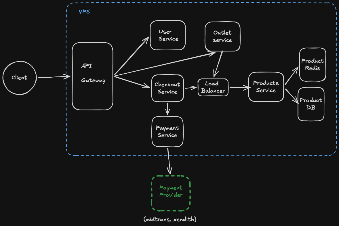
The most common format you'll encounter is a box-and-arrow diagram. Boxes represent components services, databases, external systems, user interfaces. Arrows represent how those components communicate: a request sent, a response returned, data written or read.
A box labeled "API Gateway" with arrows coming in from the left and pointing to multiple boxes on the right is telling you: all incoming requests from outside the system enter through this single point before being routed to different internal services. That's not jargon; that's a diagram telling you something specific about how your product is structured. If you know what an API Gateway does, the diagram is already legible.
If you haven't already, [→ read: What Is an API Gateway?] and [→ What Is an API?] before your next architecture review.
The Common Components You'll See (and What They Mean)
You'll encounter a small set of components across almost every architecture diagram for web or mobile products. Recognising them is most of the work.
Frontend / Client. Usually on the far left or top of the diagram. This is the interface your users interact with: the web app, the mobile app. Arrows from here go to your backend or API layer.
Backend / API / Services. The middle layer. This is where the business logic lives: validating requests, processing data, coordinating between systems. You might see one box labeled "Backend" (a monolith), or many smaller boxes each handling a specific function (microservices). Both are legitimate. The difference matters if you want to understand why, [→ read: What Is a Microservice?]
Database. Usually a cylinder shape, or a box labeled with the database name. This is where data is stored. Arrows from service boxes point here to show "this service reads or writes data." If you see multiple database boxes, each service is using its own separate data store that's a deliberate architectural choice with trade-offs.
Cache. Often a box labeled Redis or Memcached, sitting between the backend services and the database. It means frequently-requested data is stored in fast memory so the database doesn't have to answer the same question thousands of times per second.
Queue / Message Broker. A box labeled Kafka, RabbitMQ, or SQS, with arrows going in from one service and out to another. This means one service is sending work to another asynchronously the sender doesn't wait for the receiver to finish. Common in high-traffic systems.
External Services / Third Parties. Boxes at the edges of the diagram representing systems your product integrates with: payment gateways like Midtrans or GoPay, mapping APIs, SMS providers, authentication services. Arrows point out of your system to these.
What the Arrows Are Actually Telling You
Arrows are the most information-dense part of a system architecture diagram, and the part most founders skip.
An arrow from Box A to Box B means A talks to B. The direction matters. If the arrow goes both ways, they talk to each other. If it only goes one direction, the communication is one-way.
Look at which direction data flows. In a typical web request, data flows in from the user, through the API, to the database, and back out. That's a simple path. In a more complex system, one request might trigger five internal calls: the API calls a user service, which calls an authentication service, which calls a permissions service, which calls the database, before the response comes back. A diagram that shows this path is telling you something important about how much can go wrong and where.
When a diagram shows many arrows crossing in complex ways, that's not necessarily good engineering. High coupling between services creates fragility if one service slows down, everything connected to it slows down. A good question to ask your team: "What happens to user experience if this service here goes down?" The answer tells you a lot about how well the system has been designed.
The Part Most Founders Don't Ask About
Most founders look at what's in the diagram. They don't ask about what's missing.
Every architecture diagram has implicit assumptions. Data has to be stored somewhere is backup shown? Traffic comes in from users is there a load balancer distributing it, or does everything hit one server? Services communicate is there anything handling the case where one service doesn't respond?
Ask your team: "What happens when X fails?" for each critical component. Not "will it fail?" assume it will, because eventually everything does. What happens next? Is there a fallback? Does the whole system go down, or just that feature? Does the system degrade gracefully, or hard-fail?
The teams that have thought through failure are the ones who've drawn it. If failure modes aren't on the diagram, they may not have been designed for.
Reading a Diagram in Practice
Here's a practical approach to the next architecture review you sit in.
Start by asking what the diagram represents before trying to read it. Is it the current system? A proposed change? A specific incident post-mortem? That shapes how you interpret everything else.
Identify the entry point: where do user requests come in? Follow the path from there. User hits the app, app calls the API, API does something, database stores it, response comes back. Trace that path out loud if you need to.
Ask about the boxes at the edges the external services. What happens to your product if a third-party service goes down? For Indonesian startups that depend on payment gateways, this question is especially important. Midtrans or GoPay reliability directly affects your transaction success rate, and the architecture should account for it.
Look for anything between your backend and your database. If there's nothing no cache, no queue and your product is handling significant traffic, ask why.
Understand the high-level picture from [→ What Is Software Architecture?] before your next review. It gives you the conceptual layer that makes specific diagrams much easier to interpret.
FAQ
Q: What is a system architecture diagram?
A: It's a map of how your software is structured. It shows the components of the system (services, databases, external integrations) and how they communicate with each other. It's not a code diagram; it's a structural overview meant to explain how the pieces fit together.
Q: What do the boxes in an architecture diagram represent?
A: Each box represents a component in the system: a service, a database, a frontend application, or an external system your product integrates with. The label on the box tells you what it is. Arrows between boxes show how they communicate.
Q: What should I look for as a non-technical founder reviewing an architecture diagram?
A: Look at the entry point, trace the path of a user request through the system, identify external dependencies at the edges, and ask what happens when any critical component fails. "What breaks if this goes down?" is the most useful question you can ask.
Q: What's the difference between a monolith and microservices architecture on a diagram?
A: A monolith looks like one large box handling most of the logic, pointing to a database. Microservices look like many smaller boxes each doing a specific job, each often with their own database. Both are valid but the visual complexity is a hint about team coordination overhead.
Q: Do I need to understand every detail in an architecture diagram?
A: No. Your goal is to understand the structure well enough to ask good questions and evaluate the decisions being made. You don't need to know how each component is implemented. You need to know what each component does, why it's there, and what happens if it fails.
Architecture diagrams aren't meant to be opaque. They're communication tools, and your team should be able to walk you through one clearly. If they can't explain a diagram to you in plain terms, that's useful information too either the diagram is poorly made, or the architecture is more complex than it needs to be. Both are worth understanding. At SpectreDev, every architecture decision we make has to survive an explanation to a non-technical stakeholder. That discipline usually produces better architecture.